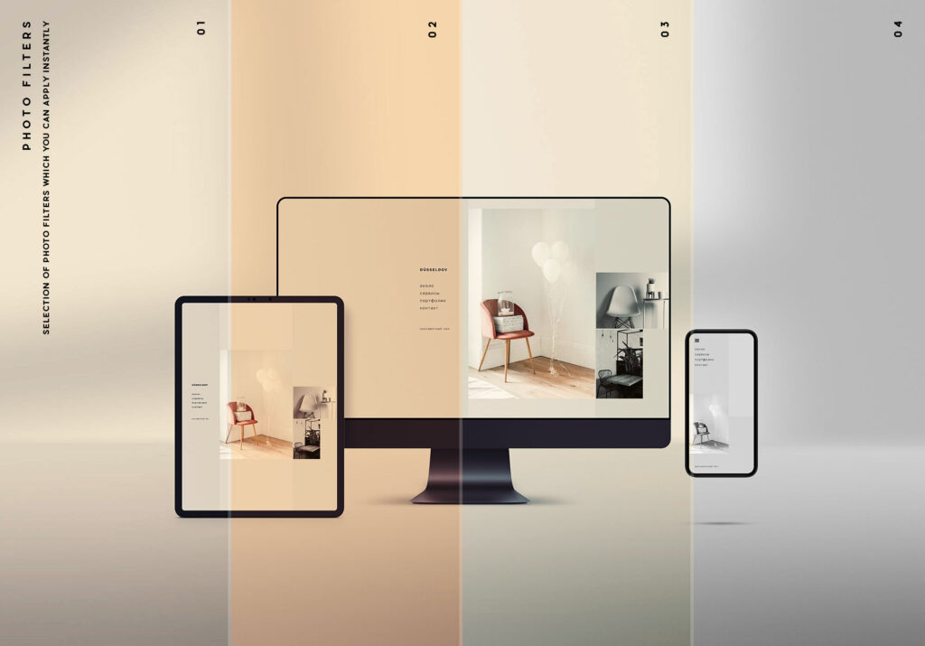
When it comes to crafting high-impact, conversion-focused web experiences, I don’t settle for cookie-cutter solutions. While Responsive Web Design (RWD) is the industry default, I deliberately lean into Adaptive Web Design (AWD)—and here’s why.
🚀 Performance Isn’t Optional—It’s a Requirement
RWD loads one set of assets and stretches or shrinks them based on screen size. The result? All users download everything, whether they need it or not. That’s digital bloat.
In contrast, AWD delivers only what’s needed, when it’s needed. That’s performance engineering—especially on mobile. With Google’s Core Web Vitals breathing down your neck, AWD gives you precise control over resource loading and layout behavior. I don’t just optimize—I orchestrate performance.
🎯 Contextual UX is King
With AWD, I design distinct layouts for distinct devices—not just “one-size-fits-all” containers. This means a mobile user gets an experience built for mobile from the ground up, not a squished-down desktop version.
That’s contextual design. It’s what drives engagement, retention, and conversion. AWD empowers me to tailor content, navigation, and interactions based on device class—think intentional UX, not reactive resizing.
🔧 Developer Control = Strategic AdvantageRWD puts the control in the hands of browsers and breakpoints. AWD puts it back in my hands. I get to define device-specific logic at the server level or client level. It’s more upfront work—but the payoff is a digital experience that feels like it was made just for the user’s device.
For high-performance brands and bleeding-edge systems, control isn’t a luxury—it’s a strategic weapon.
📊 Data-Informed Decisions, Not Just Display Tactics
RWD is reactive. AWD is proactive. It encourages us to think about the user journey in segmented flows—desktop, tablet, mobile. With adaptive layouts, we can A/B test more granularly, optimize per segment, and align design strategy with user behavior by device, not just screen size.
💡 Bottom Line
Responsive design gets you a seat at the table.
Adaptive design owns the room.
If you’re building experiences where speed, precision, and conversion matter, AWD gives you the surgical control to execute.
Share this:
- Click to share on Facebook (Opens in new window) Facebook
- Click to share on X (Opens in new window) X
- Click to share on LinkedIn (Opens in new window) LinkedIn
- Click to share on Reddit (Opens in new window) Reddit
- Click to share on Pinterest (Opens in new window) Pinterest
- Click to share on Pocket (Opens in new window) Pocket
- Click to share on WhatsApp (Opens in new window) WhatsApp
- Click to email a link to a friend (Opens in new window) Email


